Whatever else you wanna rant about.
-
Old Cage
- Hall of Fame
- Posts: 7482
- Joined: Tue Apr 01, 2003 8:49 pm
- Location: The Eastern Provinces
Post
by Old Cage » Fri Mar 31, 2023 7:07 am
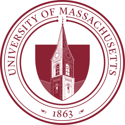
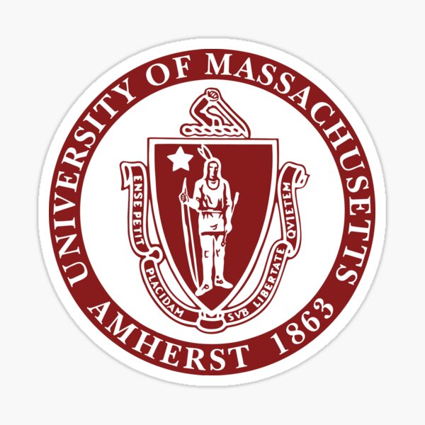
First thought: The much despised "Amherst" is gone!
"Jack didn’t have any envy in him," Calipari said. "He was the greatest coach to ever coach here."
-
LS71
- Hall of Fame
- Posts: 8813
- Joined: Wed Apr 02, 2003 8:55 pm
- Location: Lost in Space
Post
by LS71 » Fri Mar 31, 2023 9:17 am
That and the depiction of a native American....or Indian, as they used to be called...

UMass was among the first to change it's name/mascot to a non-native American one. The state is working to create a new state seal:
https://www.wgbh.org/news/politics/2022 ... sachusetts"Win without boasting, lose without crying." -- Julius Erving
-
Sheck
- Hall of Fame
- Posts: 2385
- Joined: Fri Oct 01, 2004 12:13 am
- Location: NH
Post
by Sheck » Fri Mar 31, 2023 9:43 am
The motto is the same as the state's motto. I never really thought it made much sense to have it as a motto for a university.
Like the new logo(s) though. The M is for Mothership (sorry Lowell).
Give WBB more money.
-
e_parade
- Senior
- Posts: 868
- Joined: Wed Apr 05, 2017 9:15 pm
- Location: Boston
Post
by e_parade » Fri Mar 31, 2023 9:52 am
I like it. There was no need to have a native American on there at this point, and it was definitely time (it was a while ago) to remove "Amherst" from it.
Edit: didn't mention before, but I really like the inclusion of Old Chapel on it (...especially as I have a tattoo with old chapel in it...)
-
Quann
- Hall of Fame
- Posts: 3138
- Joined: Sun Apr 06, 2003 11:17 pm
- Location: Hopkinton, MA
Post
by Quann » Fri Mar 31, 2023 4:38 pm
Not a fan of the new logo, I liked the old one. To each his own.
-
LS71
- Hall of Fame
- Posts: 8813
- Joined: Wed Apr 02, 2003 8:55 pm
- Location: Lost in Space
Post
by LS71 » Fri Mar 31, 2023 5:05 pm
It’s clean….the Old Chapel and 1863…says it all.
"Win without boasting, lose without crying." -- Julius Erving
-
inthescoop
- Hall of Fame
- Posts: 6045
- Joined: Sun Sep 25, 2011 7:40 pm
- Location: LA
Post
by inthescoop » Fri Mar 31, 2023 5:54 pm
It's actually ummmmm pretty freakin nice... did not expect to say that. I'm a fan!
-
TruBluMaroon
- Hall of Fame
- Posts: 3794
- Joined: Wed Apr 23, 2003 11:25 am
Post
by TruBluMaroon » Sat Apr 01, 2023 12:56 pm
Old Cage wrote: Fri Mar 31, 2023 7:07 am
First thought: The much despised "Amherst" is gone!
Unless, now that is not on the logo, they will feel
the need to use it to define the Amherst campus from the rest of the campuses

-
InnervisionsUMASS
- Hall of Fame
- Posts: 19011
- Joined: Fri Apr 04, 2003 1:32 am
- Location: Milford, MA
-
Contact:
Post
by InnervisionsUMASS » Mon Apr 03, 2023 7:29 am
The lack of "Amherst" in the official seal is glorious. Two thumbs up.
Stop waiting for UMass to do something big and help UMass do something big. - Shades
-
Bubba
- Sophomore
- Posts: 215
- Joined: Sat Sep 24, 2005 6:51 pm
Post
by Bubba » Wed Apr 05, 2023 12:21 pm
I don't mind it. I think it's overly complicated for a logo. I am happy to move to something less outdated, however, my biggest concern, it's basically a retread of the former UNH logo.
https://bit.ly/3KCmJ2T
-
InnervisionsUMASS
- Hall of Fame
- Posts: 19011
- Joined: Fri Apr 04, 2003 1:32 am
- Location: Milford, MA
-
Contact:
Post
by InnervisionsUMASS » Wed Apr 05, 2023 3:24 pm
I'm kinda surprised no one has mentioned this yet... this is another example of the major disconnects across segments of campus. In this case between overall University branding and Athletics branding.
If it was just the Seal, I might not be saying this... but they created a "new" 'M' logo for the school, which is different than what Athletics uses. This makes no sense.
From their posting on LinkedIn:
This is meant to be an addition to the already established Athletic mark (the “Power U”) and to expand the design elements available to visually represent the brand.
Stop waiting for UMass to do something big and help UMass do something big. - Shades
-
Quann
- Hall of Fame
- Posts: 3138
- Joined: Sun Apr 06, 2003 11:17 pm
- Location: Hopkinton, MA
Post
by Quann » Wed Apr 05, 2023 6:00 pm
The M logo is so weird. I saw it on Twitter. If you’re referring to UMass at least go “UM”. Don’t reinvent the wheel.